A Clearer Path to Disability Benefits
How might we redesign the SSA.gov pre-application process to reduce confusion and help users feel more confident applying for disability?
Snapshot


The problem
Navigating SSA.gov’s disability benefits application can be frustrating—especially for users with limited mobility or low tech confidence. The existing interface is packed with jargon, repetitive instructions, and unclear navigation. Users feel overwhelmed, lost, and fatigued before they even begin the full application process.
User Persona & Heuristic Evaluation
To understand user needs, I created a persona based on Social Security demographic data and conducted a heuristic evaluation using Jakob Nielsen’s 10 Usability Heuristics.


Users struggled with repeated data entry and confusing language.
Many felt disoriented without a clear sense of where they were in the process.
Cognitive overload was a major issue.
Wireframing & A/B Testing
I mapped out a simplified user flow that prioritized:
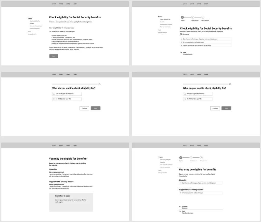
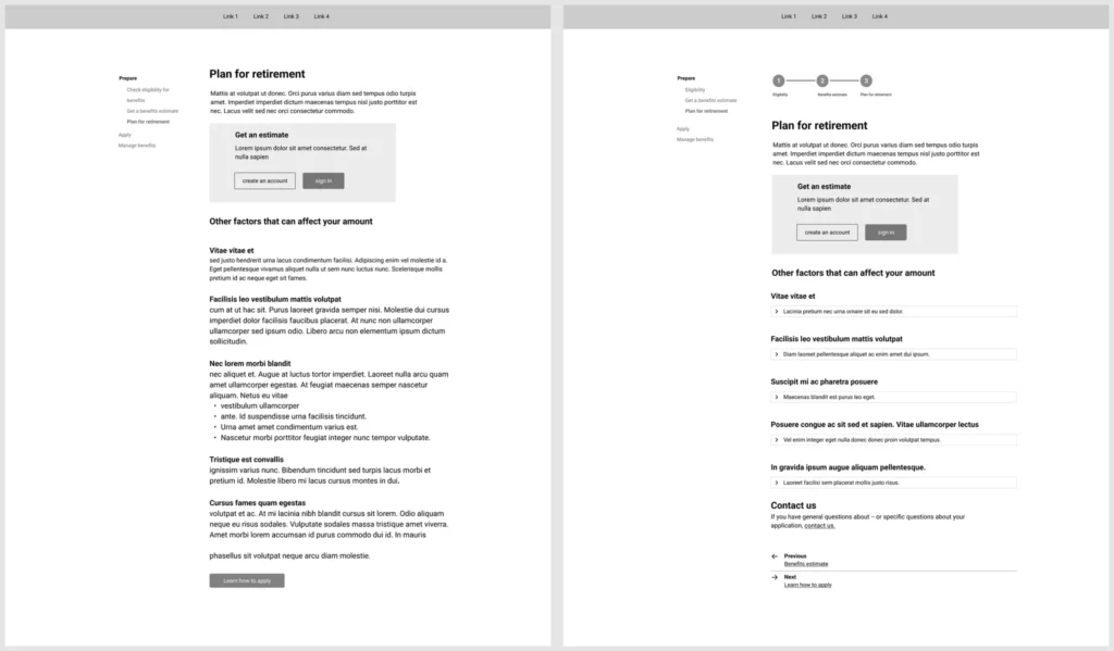
Step-by-step guidance through a progress bar
Fewer clicks to reach essential information
Optional exploration through a self-assessment tool
Key Design Decision:
I replaced early account creation with a self-assessment tool, so users could get benefit estimates without commitment—building trust and reducing friction.
To validate the redesigned flow, I conducted A/B testing using a think-aloud protocol with users of varying digital literacy levels. Participants were split between the original SSA.gov interface and the redesigned version. Each participant completed key tasks like navigating steps, estimating benefits, and locating eligibility information—all while verbalizing their thought process.
The left column represents the current SSA website, while the right column represents the revised version.
Challenges & Iterations


Improved Designs & Features
The revised prototype focused on clarity and ease of use. Core updates included:


Results & Imact
📈 Users reported feeling more confident and less overwhelmed using the redesigned version.
💬 Participants appreciated the sense of control and clarity, especially from the progress indicators and navigation buttons.
🔍 The study highlighted how even minor design changes—when grounded in user needs—can dramatically improve trust and usability in government platforms.
Final Thoughts & Next Steps
This project showed the power of thoughtful design in reducing barriers to access. While it focused on the pre-application stage, the same approach could scale to other government processes. Future iterations could incorporate real-time chat support, mobile responsiveness, and adaptive accessibility features for a wider range of users.
